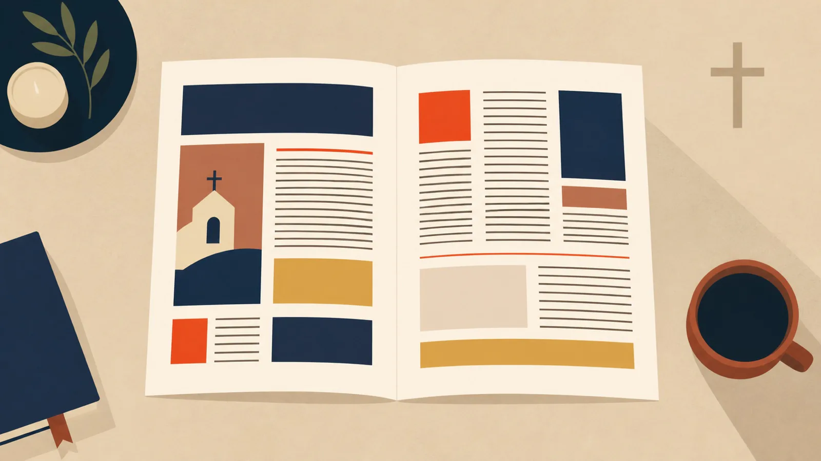
Reliable parish bulletin design has a difficult job. It has to carry Mass times, ministry notices, formation details, contact information, and occasional urgent changes. It is often assembled quickly by someone who has several other responsibilities. That is exactly why a small set of rules makes such a large difference.
An effective bulletin does not need to look luxurious. It needs to let a reader find the right information without working for it. The mistakes below are common because they appear to solve a space problem while making the page harder to use.
1. Treating every announcement as equally important
When every item uses the same bold heading, same font size, and same box treatment, the reader has no route through the page. Important announcements disappear among routine reminders.
Create levels. The primary item might be a change to Mass times, a registration deadline, or a major parish event. Give it the most space and the clearest location. Secondary announcements can share a consistent smaller structure. Ongoing information such as office hours, staff contacts, and recurring groups belongs in a stable area that readers learn to find.
This is not a judgment on the importance of ministries. It is a reading decision. A bulletin becomes more respectful of every ministry when readers can actually locate its information.
2. Filling every open space
Crowding is often caused by fear of blank space. A page with a small margin, narrow gaps between columns, and text pressed against rules may contain more words, but it feels less readable.
Margins give a page a boundary. Space between items tells the reader where one announcement ends and another begins. Use a grid with a consistent outer margin and a regular gap between columns. If content does not fit, shorten it, move it online, or continue it in the next issue. Shrinking every type size should be the last option.
White space is not wasted capacity. It is the structure that allows information to be scanned.
3. Using too many typefaces and effects
A bulletin does not need a different font for every ministry. Multiple decorative fonts, outlines, shadows, and underlines make the page feel assembled from unrelated documents.
Use one reliable typeface family, or one serif and one sans serif with clearly different roles. Set a small hierarchy: title, section heading, announcement heading, body copy, and caption. Repeat those styles consistently. Bold weight and spacing are usually enough to create emphasis.
Avoid all caps for paragraphs and compressed display fonts for essential information. Both make reading slower. Script fonts may be suitable for a short decorative word, but they should not carry dates, registration instructions, or contact details.
4. Leaving announcements unedited
The same paragraph sent by email, copied into a bulletin, and posted online rarely works well in all three places. Bulletin copy needs a clear first line, the essential fact, and a way to act.
Edit announcements to answer: what is happening, when, where, who is it for, and what should the reader do next? Put the date and action near the beginning. Remove internal background that a parishioner does not need to make a decision.
For example, “The St. Vincent de Paul Society will meet Tuesday, October 14, at 6:30 p.m. in Room 3. New volunteers are welcome; contact Ana at…” is stronger than a long account of committee planning before the date appears. Editing protects the page as much as design does.
5. Forgetting paper and accessibility
Many bulletins are read by people with reduced vision, under inconsistent lighting, or after being photocopied. Pale gray type, small body text, and low-contrast color choices fail in those conditions.
Use dark body text on a light background. Keep the body size comfortable for the actual paper size. Do not depend on red and green alone to distinguish categories. Test a black-and-white print before the Sunday run. If a QR code is included, give it enough size and a short URL or contact alternative for people who cannot scan it.
These choices are practical, not ornamental. They determine whether the information reaches the people it was printed for.
6. Rebuilding the page every week
Weekly improvisation creates errors. A stable bulletin template can have fixed areas for Mass times, contacts, recurring groups, major announcements, and service information. Staff then spend their time updating facts rather than redesigning the page.
The template should be flexible enough to handle an unusually full week, but its core grid and styles should remain. That makes the bulletin familiar to readers and easier to prepare. It also helps a replacement staff member or volunteer take over without losing the structure.
For an example of publication work where hierarchy must hold across many pages, see the CONTATTO case study, a 31-page quarterly publication for the Curia General OFM (JPIC) in Rome.
Start with one issue, not a full reinvention
Choose a recent bulletin and mark what people need to find first. Remove duplicate headings, shorten two or three long notices, set a reliable margin, and reduce the type choices. Those changes are enough to reveal the page's natural hierarchy.
Once that is working, save the styles and build the template around them. The goal is a bulletin that can be produced calmly on a busy week and still look like it came from one institution.
If your parish needs a more durable publication system, see the portfolio for examples of editorial design built to carry real information.