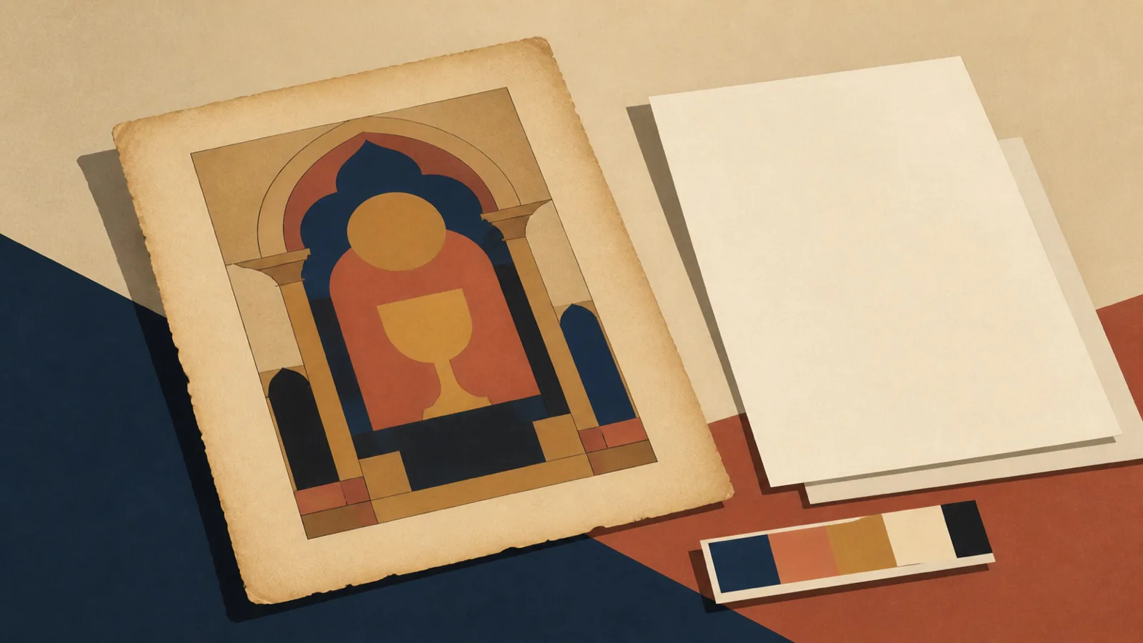
Good public domain religious art is a valuable resource. It gives parishes, schools, and ministries access to centuries of visual culture without negotiating a license for every use. The problem is not that it is old, or that it is free. The problem begins when an image is used without considering whether it belongs to the communication in front of it.
The same cropped painting can appear in a parish bulletin, a retreat poster, a school worksheet, and a social post from another continent. It may be legal in every case. It may also make each piece feel inherited rather than made for its audience.
Good use of historic art requires selection, context, and a system around the image.
Legal permission is not creative fit
“Public domain” generally means a work is no longer protected by copyright in a particular jurisdiction, but the source file can still have conditions. A museum may publish a high-resolution image under a specific license or request attribution. A photograph of a public-domain painting may have its own rights depending on where it came from. Check the stated rights at the source before publication.
Once the legal question is settled, there is a second question: does this image suit the message and the audience? An eighteenth-century engraving may work beautifully for a study guide that asks readers to slow down. It may be a poor fit for a youth event whose information needs to be read in two seconds on a phone.
Historic art is also culturally specific. It carries the visual language, dress, architecture, and devotional assumptions of its time. That can add depth when the context is acknowledged. It can feel remote when dropped into a contemporary announcement with no relationship to the text.
Do not treat any old religious image as interchangeable atmosphere. Choose it because its composition, subject, or emotional register helps the communication do its job.
The familiar image may already be exhausted
Some images are used so often that they become visual shorthand: a cropped detail of praying hands, a stained-glass dove, a classical Sacred Heart, a Renaissance Madonna. Familiarity is not always a fault. It can offer recognition and continuity.
But repetition can make a piece difficult to distinguish. When every Advent post uses the same painting of the Annunciation, the audience stops seeing the image. A new layout alone may not solve that. The image itself has become expected.
Before choosing a public-domain work, make a small search of your own recent material and the channels you share. If the same subject has appeared repeatedly, look for another moment, another medium, or another compositional view. A wider crop, a detail that supports the actual message, or a less commonly reproduced work can make familiar tradition feel present again.
Avoid the temptation to force a painting into a narrow social format by cropping away the meaning. A figure's gesture, the relationship between two people, or a key piece of architecture may be the reason the painting worked. If the crop loses that, select another image rather than treating the artwork as a texture.
Build the message around the image, not on top of it
Religious art often has dense detail and varied value. Placing a long event title directly over it usually produces a compromise: either the text is hard to read or the art is obscured by a heavy box.
Use a layout that gives each element enough room. A simple approach is to place the image in one area and the information on a quiet paper-colored field. Another is to use a restrained crop with a generous margin for type. A caption can identify the work, artist, and source where appropriate without making the piece look like a museum label.
Keep the typography and supporting colors quiet. A historic painting does not need ornamental type to look sacred. In fact, decorative fonts often compete with its detail and make the resulting piece feel like a souvenir. Clear type, deliberate spacing, and one supporting color are usually stronger.
Accessibility belongs here too. Do not use small pale lettering over a complicated painting. If essential information cannot be read at ordinary size, it is not being communicated. Supply alt text that describes the artwork and explains any information that the image carries, rather than assuming the image is merely decorative.
Know when a custom visual system is the better tool
There are times when public-domain art is not the best solution. A nine-day social series, a faith-formation curriculum, a campaign that needs several related images, or an institution building a distinct library needs consistency across more than one piece.
In those cases, a custom illustration system can provide recurring forms, a limited palette, and a shared visual voice without asking one painting to perform every job. The result can still draw on biblical narrative, symbols, and tradition. The difference is that it is designed to work at the specific sizes and rhythms of the project.
This is also useful where representation needs care. A flexible illustration system can focus on objects, places, gesture, color, and narrative structure rather than relying on a single inherited visual type. It can help an organization create material that feels coherent without claiming that every communication needs a newly commissioned scene.
The biblical illustration case study shows a vector-based series built around the Old Testament. The value of a series is not novelty for its own sake; it is the ability to use related visual material across a body of work.
A simple selection process
Before publishing a public-domain image, ask five practical questions. Is the source and its stated rights clear? Does the image support this exact message rather than merely a general religious feeling? Has your audience seen this image repeatedly? Will it survive the required crop and format? Can the information beside it remain readable?
If the answer to one of those is no, the image may still be useful elsewhere. It simply is not the right tool for this piece.
Historic art deserves better than being used as a generic background. And a parish communication deserves imagery that helps its audience understand what is being asked of them. If you need a coherent illustration direction for a publication or series, explore the illustration work.